Your LinkedIn Photo and Banner at Executive Level
Most senior leaders spend hours on their LinkedIn headline and About section. Then they leave a photo from a wedding six years ago and the default blue banner at the top of the page.
That is a problem, because the photo and banner are the first things a visitor sees. Before a search consultant reads a word, they have already formed a view. Is this person current? Do they look like the level they are aiming for? Do they take their profile seriously?
From my years on the recruiter side, a weak photo rarely ruled anyone out on its own. But it made the rest of the profile work harder. A clear photo and a clean banner do the opposite.
Why the first impression matters more at senior level
At executive level, your LinkedIn profile is often checked by people who are deciding whether to call you. A search consultant building a longlist. A chair looking at candidates before a meeting. A future peer who wants to know who is coming in.
These readers move fast. They scan the top of the page, and the photo and banner set the tone for everything below.
A dated or casual photo can suggest that you are not active in the market, or that you do not see yourself at the level you want. That may be unfair, but the fix is simple.
Photo basics that work
A good executive LinkedIn photo is not complicated. It follows a few plain rules.
Recent. The photo should look like you today. If someone meets you for coffee and does not recognise you, the photo is too old.
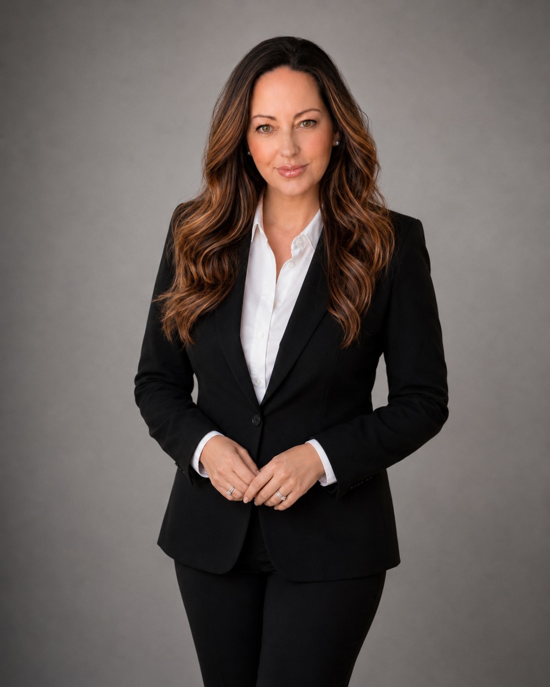
Your face, clearly. Head and shoulders, facing the camera or close to it. Your face should fill a good share of the frame. Group shots, cropped holiday photos and distant shots on a stage do not work.
A simple background. A plain wall, an office setting that is slightly out of focus or an outdoor shot with a soft background. Nothing that pulls the eye away from you.
Good light. Soft, even light on your face. Natural light from a window works well. Avoid strong shadows, harsh overhead light and backlighting that turns you into a silhouette.
A natural expression. Most people look more approachable with a slight smile. You want to look like someone a board would enjoy working with, not someone posing for a passport.
Real, not retouched. A professional photographer makes this easy. A phone at eye level, facing a window, can also work. Either way, skip heavy filters and editing.
Dress for the role you want
A simple rule is to dress the way you would for a meeting with the people who might hire you next.
For most CFO, finance director and general management roles in Australia and New Zealand, that means business dress. It does not need to be formal. A jacket with an open collar often works well. But it should look like a working day, not a weekend.
If you are aiming at a board or chair role, lean a little more formal. If you work in a sector where suits are rare, such as some technology or creative businesses, match the norms of the people you want to work with.
What to avoid in your photo
A few photo choices come up again and again, and they all make a senior profile look weaker than it is.
No photo at all, which can make a profile look inactive or incomplete
A photo that is many years old
A crop from a group or event shot, with someone’s shoulder in the frame
Sunglasses, hats or anything that hides your face
Photos with children, pets or partners, however much you love them
Very casual settings, such as a beach, a boat or a barbecue
A logo, slogan or cartoon in place of your face
Dark, grainy or blurred images
None of these is fatal alone. Each one makes the reader work a little harder to take you seriously.
Banner ideas that work at executive level
The banner is the wide image behind your photo. Most people leave the default, and that is better than a poor choice. But a simple banner can add a quiet signal about who you are.
Keep it simple. A banner is a background, not a poster. One image or one colour field with, at most, a short line of text.
Keep it relevant. A city skyline where you work, a scene from your region, an abstract texture or a plain colour block can all work. Choose something that fits the tone of your profile.
Use your colours. If you have a personal brand or consistent colours on your resume and other material, use them here too. It makes your presence feel joined up.
Add a line of positioning, if it suits. Some executives add a short phrase such as “Finance leadership for growing businesses” or “CFO and non-executive director”. Keep it to one line and make sure it matches your headline. If you are in a role and prefer to be discreet, leave text off.
Keep it uncluttered. Your photo sits over part of the banner, and the layout differs between phone and desktop. Keep any text away from the edges and check how it looks on both.
Our guide to writing your LinkedIn headline and About section covers the words that sit just below the banner, and the two should say the same thing.
Before and after: an illustrative example
Here is an illustrative example of how the top of one profile might change.
Before: A photo cropped from a work conference five years ago, taken from the side, with a lanyard visible. The default banner. The headline says “Chief Financial Officer at [company]”.
After: A recent head-and-shoulders photo against a soft grey wall, in a jacket with an open collar, looking at the camera with a slight smile. A banner in deep navy with a faint texture and one line of text on the right: “Finance leadership for growth and change”. A headline that sets out scope and focus, not just the title.
A search consultant landing on it sees someone current, credible and clear about where they fit. The details here are illustrative only. Use your own colours and wording.
When employer branding is fine
Many organisations offer staff a branded LinkedIn banner. For senior leaders, this is often a sensible choice while you are in the role.
It shows you are aligned with your organisation, and it signals nothing unusual to your employer.
There are a few things to think about, though.
Employer branding ties your profile closely to your current role. If you are building a profile for the next step, a personal banner gives you more room.
If you leave, remember to change it. A banner for a former employer looks careless.
If you hold board roles or run a side practice, a neutral banner may fit better than one tied to a single organisation.
Choose what suits you now, and review it when things change.
Keep it consistent with your wider presence
Your photo and banner should match the rest of how you show up. If a search consultant sees your LinkedIn profile, your organisation’s website and a conference speaker page, they should recognise the same person.
The photos do not need to be identical, but they should be recent and clearly you. The same goes for wording. If your banner says “CFO and non-executive director”, your headline and About section should say the same. Our piece on using the Featured section explains how to carry that message further down the page.
Common mistakes
Treating the photo as an afterthought. It is the first thing people see. Give it ten minutes of attention and it will pay you back.
Overloading the banner. Several logos, a list of skills and a quote make the top of the page feel busy. One clear message is enough.
Mismatched messages. A banner that says one thing and a headline that says another leaves the reader unsure who you are.
Forgetting the phone view. Many people look at LinkedIn on a phone first. Check that your photo and banner still work at that size.
Trying too hard. Studio lighting, dramatic poses and heavy editing can look staged. You want to look like a capable leader, not a campaign poster.
Questions to ask yourself
Would a stranger recognise me from this photo if we met today?
Does my photo look like the level I am aiming for?
Is my face clear, well lit and the main focus of the frame?
Does my banner support my message, or distract from it?
Does any text on my banner match my headline?
If I use an employer banner, am I comfortable with that link for now?
Do my photo and banner look right on a phone as well as a desktop?
If you answer no to any of these, that is your starting point.
How this fits with the rest of your presence
A photo and banner will not win you a role. They make sure the rest of your profile gets read with an open mind. The same idea applies in person, where panels form early views before you have said much. Our piece on executive presence in interviews covers that side of it.
If you are based in New Zealand or moving across the Tasman, the norms are much the same. Our guide to LinkedIn for New Zealand executives covers the points that differ.
A simple step with a clear return
A strong executive LinkedIn photo and a clean banner take little time and cost little. They tell every visitor that you are current, credible and clear about where you are heading. Update the photo, simplify the banner and make sure both match the words below them.
If you want a LinkedIn profile that looks and reads like the role you are aiming for, see how I approach executive LinkedIn profile writing.
If you are a senior leader getting ready for your next move, book a complimentary Clarity Session and we will look at how your LinkedIn profile lands with a search consultant today.